Jessey Sahdra is the co-owner of the Bagel House, a bakery with three locations in Toronto that specialize in hand-rolled, honey-boiled, Montreal-style bagels.
 Farmers bring in the harvest in Russia. The Russian government has banned grain exports due to a severe drought that has reduced this year's estimated harvest by a third. (Ivan Sekretarev/Associated Press)
 Sahdra says business is good but with the price of wheat escalating he is starting to worry. In the past three weeks, the cost of a 40-kilogram bag of flour has gone up by $3, a loss that he has decided to sustain in profit rather than pushing up prices.
"It's hard, I increased the price when HST hit, and then price of flour went up," Sahdra said. "Business is the same but now I am suffering."
The impact of wheat prices is being felt all over the globe, to varying extremes.
In Mozambique, a 30 per cent rise in bread prices triggered riots on Wednesday and Thursday, killing seven people and wounding another 288. Police opened fire on demonstrators after thousands turned out to protest against the price hikes, burning tires and looting food warehouses. Officials estimate the damage at $3 million US, the Financial Times reported Friday.
When Russia announced Thursday an extension to its grain export ban by another 12 months, December futures shot up 9.5 cents a bushel to $7.23, nearing August highs that saw futures above $8.
As the grain markets continue to roil and commodity traders rally, the world watches with trepidation as food prices climb to their highest level in two years, sparking concerns of a repeat of the 2007-08 food shortage.
Yet the forecast for world cereal production in 2010 — even with its lowered yield from wildfires in the Black Sea region, drought in Australia and floods in Canadian Prairie provinces, is still expected to be the third highest on record at 644million tons — down 33 million from last season's record breaking 677 million.
"Russia temporarily halting exports is a big concern," said Amy Reynolds senior economist with the International Grain Council. "In global terms, however, there isn't really anything to be concerned about … supplies are less than expected [this year] but availability is more than ample."
'In global terms, however, there isn't really anything to be concerned about.'—Economist Amy Reynolds
The IGC estimates that world wheat stocks at the end of 2010-11 will be approximately 184 million tons, a drop of about eight million from July, and mainly due to reduced crop yields from Russia, Kazakhstan and the Ukraine. "These are still at a comfortable level," said Reynolds.
As the world population continues to multiply toward seven billion, the demand for food continues to soar. The IGC forecasts wheat consumption for 2010-11 at a record 657 million.
According to Peter Johnson, a provincial cereal specialist with the Ontario Ministry of Agriculture, Food and Rural Affairs, it's not consumers who are driving prices and nor is it the producers, "the speculators are," he said.
"Net production in Canada is down [so] the perception of production is that it is down in general. Chicago [Board of Trade] is no longer the price discovery mechanism that it should be in the wheat market."
 People shop for vegetables at the farmers' market in Berkeley, Calif., in September 2008. Environmental catastrophes have threatened to drive global food prices higher this year. (Eric Risberg/Associated Press)
 "Policy is the thing that affects price and price is largely determined in the Chicago futures market," said Alphons Weersink, a professor of agri-environmental policy at the University of Guelph, adding that it should be a good year for many Canadian wheat farmers. "The prices are favourable."
A spokesman for the Canadian Wheat Board said Canadian consumers will hardly "bat an eye" even if the price of wheat doubles.
"An increase in prices can definitely benefit farmers, but it doesn't necessarily translate into higher costs for consumers. We're talking pennies per loaf of bread," said John Lyons.
Not so for the developing world.
In its latest update, the United Nation's Food and Agriculture Organization's Food Price Index averaged 176 points in August, up nearly nine points from July according to its latest update on the global cereals supply and demand situation.
The increase — five per cent — brought the Index up to its highest level since September 2008, still below its peak in June 2008 of 38 per cent but enough to prompt the UN agency to call an emergency meeting to discuss the wheat shortage.
The Food and Agriculture Organization told the Financial Times that "the concern about a possible repeat of the 2007-08 food crisis" had resulted in "an enormous number" of inquiries from member countries. "The purpose of holding this meeting is for exporting and importing countries to engage."
As prices continue their upward trend even a conversation between world traders about increasing world exports may be to little to late. The IGC has lowered the forecast for global trade in 2010-11 by 3.4 million tons, to 117 million because the price increase has reduced the amount that they expect wheat producers to export, including Canada.
"We generally export everything that is not used domestically but since production is down, we'll likely be exporting less this year," said Lyons.
Ultimately, grain prices are always going to hinge to a certain extent on the vagaries of climate.
"The price rally on the wheat market was really weather driven," said Weersink, noting that better weather next year could mean a better global wheat crop, lower prices and more exports. "This is not going to keep the market at higher levels for too long."
Snow in the Alps a month earlier than normal Snow in Alpslink
INNSBRUCK- Not Called avenue in Netherlands seems like autumn. In Austria the first snow fell again Tuesday. The weather service expects that even the snow line in Some part of the country Tuesday to drop 1100 meters
Monday morning at approximately 1500 meters this Committee so that the ski stations such as in the Vorarlberg Regional evil lay a white tea is Kwame. That was all white Zürs on Monday.
"It's not that hot first chosen as early snow at this altitude, but is particularly Called DO. Called It usually takes months or a dealer," said Hajo Smit Sneeuwverwachting.nl winter weatherman. "The Master dwellers Does she even cows nand bears tail.
Smith was also named Volga especially that hot southern Norway this week a team of snow lay EvilDickIn Search of Cooling Trends
by
Verity Jones and
Tony Brown (Tonyb)
link
Back in October Tony asked me to help with a big idea. Searching Norwegian climate site Rimfrost (
www.rimfrost.no) Tony had found many climate stations all over the world with a cooling trend in temperatures over at least the last thirty years – which is significant in climate terms. You see Tony had a grand vision of a website with blue dots on a map representing these “cooling stations”, where clicking on the dots brought up a graph of the data and the wonderful cooling trend. Would this not persuade people to look again at the notion of worldwide global warming?
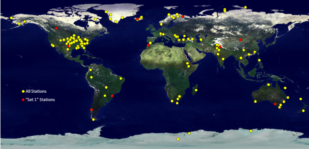
Figure 1. Map showing stations on Tony's "Cooling List" - stations which appear to have a cooling trend (>30 years) to present (data source: www.rimfrost.no Oct-Dec 2009; Earth image source: Dave Pape)
I asked Tony how many stations he had in mind. “Oh two hundred or so…” He suggested breaking it down into bite-sized chunks and sending me sets of ten at a time. I was to compare the data with that on the GISS site and/or those of national met agencies where available to verify the source, and produce graphs to a standard template.
We were concerned that this could be seen as ‘cherrypicking’ nonetheless it was an attractive idea. In many cases it was not just cherrypicking the stations, but also the start dates of each cooling trend. Despite these reservations we decided to go ahead, although ultimately we have not completed the project, partly for these reasons, but also because it is a case where the journey became more important than the destination and it is worth sharing.
The first 10 (Set 1) of Tony’s target stations, which at this point I should say seemed to be a randomly chosen set, were:
- Brazil – Curitiba (1885 to 2009) Cooling 1955 to 2009
- Canada – Edmonton (1881-2009) Cooling from 1886 to 2009
- Chile – Puerto Montt (1951-2009) Cooling from 1955
- China – Jiuquan (1934-2009) Cooling all years
- Russia – Kandalaska (1913-2009) Cooling 1933-2009
- Iceland – Haell (1931-2009) Cooling all years
- India – Amritsar (1948-2009) Cooling all years
- Morocco – Casablanca (1925-2009) Cooling all years
- Adelaide – Australia (1881-2008) Cooling all years
- Abilene, Texas – USA (1886-2009) Cooling 1933-2009
The comparisons in many cases were not straightforward. While many matched GISS data, some of the graphs in Rimfrost used unadjusted data, others homogenised data. For some such as Kandalaska, there was a close but not exact match to either GISS data set. The data for Haell was clearly from the Icelandic Met Office, but I could find no match for Edmonton to any GISS series or data from Environment Canada (although having looked at Canadian data
further since I am not entirely surprised). The first set took much longer than we had anticipated; however, I drew the graphs to a template and prepared to start on Set 2.
Tony also wanted a ‘spaghetti’ graph for the anomaly data of the first set, and this is where it got most interesting. In fact we were blown away by what the graph looked like. Taking these ten locations from across the globe and superimposing the anomaly data produced a sine wave-like pattern (Figure 2) with distinct cooling from the early 1940s to mid-1970s followed by warming to present; for many of the locations the older data was warmer, or at least as warm as present. Now I had seen this before with many individual stations, but it really impressed me to see the pattern matching from such far-flung locations.
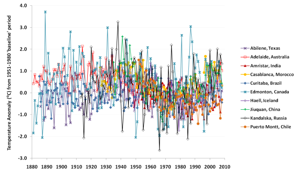
Figure 2. "Spaghetti graph" of anomalies for the ten stations in Set 1.
But in the meantime there were other developments. Tony knew I was interested in putting the GHCN v2.mean temperature data from stations all over the world into a database. As usual, this exceeded my own knowledge and capabilities, but I had made a start and was learning as I went along. Tony, whose contacts and connections never cease to amaze me, put me in touch with a computer professional, database, web and mapping expert who was well known to commenters on The Air Vent, Climate Audit and WUWT as “KevinUK”. Kevin was also keen to put climate data into a database.
By now this was the end of November. Kevin and I rapidly established a good rapport by email and voip and, with really only a few pointers to GHCN and GISS datafiles from me (and probably lots of hindrance), he rapidly built a fully functional database. Not only that but he set about writing software to plot graphs and calculate trends from the data and put the whole lot on an interactive map – and all this in a period of about 6 weeks. It is still a work in progress, fixing glitches and preparing Version 2.0; for more information see blog post
Mapping Global Warming and the website itself:
www.climateapplications.com.
I did deliver 40 graphs for Tony in the end, but I was quite slow about it (and that “sine wave” pattern kept showing up again and again and stuck in my mind). Tony had moved on to researching other climate projects and Kevin’s maps meanwhile showed so much more than we ever could. With the “sine wave” climatic pattern in mind, the following maps (focussing on North America and Europe) show how climate has cooled, warmed, cooled and warmed again since 1880.

Figure 3. Maps showing temperature trends at weather stations for defined periods. Cooling trends are shown by blue colours: dark blue>blue>light blue>turquoise>pale turquoise. Warming trends are shown by reds: dark red>red>light red>orange>light orange. For full legend see: http://diggingintheclay.wordpress.com/2010/01/18/mapping-global-warming/
So is this “sine wave” the true climate signal? It would seem so, although we can’t expect it always to be so regular. Choosing stations that are more closely geographically located does give a more homogeneous shape to the wave.
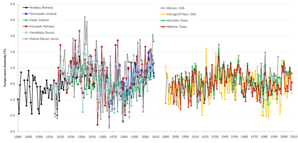
Figure 4a (left) Anomaly data for a subset of Arctic stations ; Figure 4b (right) Anomaly data for a four US stations.
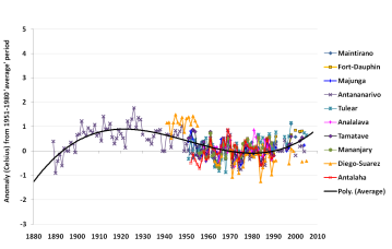
Figure 5. Anomalies of unadjusted data for stations in Madagascar
It is most extreme in the high Arctic – Figure 4a shows the graph for six stations above 64N where the magnitude of change is +/- several degrees Celsius. Further south (e.g. Figure 4b – four stations in the US) the magnitude is smaller, and close to the equator (Figure 5, Madagascar) the magnitude is less still.
A final point – with the exception of the Madagascar graph, which was prepared for a blog post (
link), all these graphs were part of different sets (the first 40 stations for which data was examined). Although the original data was chosen for its cooling trend this, in many cases, results from warmer temperatures in the period 1930-1940 than present.
The wave pattern is still present in many data sets worldwide,
no matter what the overall trend. In some the date of the onset of warming or cooling is later or earlier, depending on location – as would be expected with the oceans moving warmth around the globe. In others however the wave pattern is not present or is obliterated by something – in these sets should it be present or not? Is it wiped out by anthropogenic effects on the temperature record such as growth of cities and even small rural communities though the otherwise cooling 40s, 50s and 60s?
For us the take-home message of this study was simply how widespread and consistent the wave pattern is, and this, ultimately is very convincing of the veracity of the arguments against CO2 as a primary cause of current warming. From the physics I don’t doubt it has a role in warming, but its role needs to be disentangled from the
large magnitude natural climate swings that are clearly present all over the world – a pattern that is not widely disseminated.
Earl sputters and the Atlantic quiets down a bit

Hurricane Earl is quickly losing steam as it barrels northward and begins its recurvature in the middle latitudes. The main threat to New England will be a broad area of tropical storm force winds with gusts near hurricane force. Yet, the threat will be relatively brief as the transitioning storm moves into Canada.
Also see Anthony’s collection of satellite loops from yesterday’s post:
Link
As an update to the 2010 Atlantic season in general, the development of four consecutive African Easterly Waves into Danielle, Earl, Fiona, and Gaston really got weather enthusiasts excited — and the public a little weary of potential US impacts. However, with Danielle and Fiona destined to be fish-storms, and Earl moving away from the US, that leaves the remnants of Gaston (now just a tropical low) as the main consideration over the next 10-days.
The very reliable
ECMWF forecast model does not redevelop Gaston and sends the next wave off of Africa quickly northward. So, at least through the next 10-days, unless something develops close to home, the Atlantic looks relatively quiet especially compared to the recent burst of activity.
The seasonal forecasts all expected an above average year — we are at the letter G — with two big storms: Danielle and Earl, and another hurricane Alex as the main Accumulated Cyclone Energy (ACE) producers of the season. Just as a thought, the expected active 2007 season had many storms (15 – through Olga), but only two, Dean and Felix, managed to produce 3/4 of the total ACE. The other storms were relatively weak, short-lived, and not particularly memorable.
I produced a plot for
Roger Pielke Jr on his blog, and I have updated it through today. The current ACE is about 62 and that is about 10 days ahead of climatology in the Atlantic based upon the past records from 1950-2009. The peak of the season is September 11, so there is still half the season (at least) ahead of us.

Figure: Atlantic ACE to date (little black dots) and climatology (little red dots) based upon 1950-2009 storm records. The forecast ACE for the MetOffice (UK), NOAA, and Gray and Klotzbach (CSU) are indicated on the plot.
 High unemployment is undermining the US recovery
  Farmers bring in the harvest in Russia. The Russian government has banned grain exports due to a severe drought that has reduced this year's estimated harvest by a third. (Ivan Sekretarev/Associated Press)
 People shop for vegetables at the farmers' market in Berkeley, Calif., in September 2008. Environmental catastrophes have threatened to drive global food prices higher this year. (Eric Risberg/Associated Press)


No comments:
Post a Comment
Note: only a member of this blog may post a comment.